

所属分类:web前端开发
前端(vue)入门到精通课程,老师在线辅导:联系老师
Apipost = Postman + Swagger + Mock + Jmeter 超好用的API调试工具:点击使用
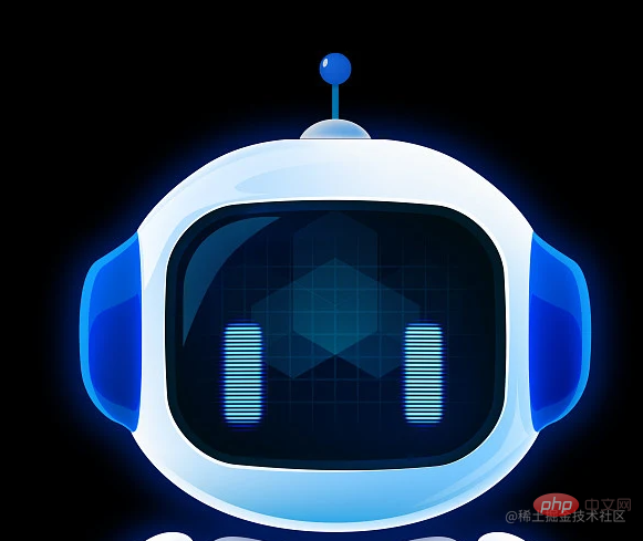
机器人眼睛

【推荐学习:css视频教程、jQuery视频教程、web前端视频】
机器人样式参考了下图,通过css拼造型的方式进行实现。部分还原了设计图
 <div class="tianxian"></div>
 .tianxian{
    width: 35px;
    height: 35px;
    border-radius: 50%;
    background: #0e58cc;
    position: absolute;
    left: 0;
    right: 0;
    top: 0;
    margin: auto;
  }
  .tianxian::after{
    content: '';
    display: block;
    width: 5px;
    height: 10px;
    border-radius: 12px;
    background: #fff;
    position: absolute;
    top: 10px;
    left: 5px;
    transform: rotateZ(20deg);
  }登录后复制
整体布局采用绝对定位布局 利用整个头部,实现耳朵和眼睛的定位
<div class="head">
      <div class="erduo"></div>
      <div class="erduo"></div>
      <div class="face">
        <div class="eye"></div>
        <div class="eye"></div>
      </div>
</div>登录后复制 box-shadow: -5px -5px 30px 1px #0075af inset;
登录后复制基于浏览器提供的SpeechSynthesisUtterance Api进行实现
SpeechSynthesisUtterance.lang 获取并设置话语的语言SpeechSynthesisUtterance.pitch 获取并设置话语的音调(值越大越尖锐,越低越低沉)SpeechSynthesisUtterance.rate 获取并设置说话的速度(值越大语速越快,越小语速越慢)SpeechSynthesisUtterance.text 获取并设置说话时的文本SpeechSynthesisUtterance.voice 获取并设置说话的声音SpeechSynthesisUtterance.volume 获取并设置说话的音量speak() 将对应的实例添加到语音队列中cancel() 删除队列中所有的语音.如果正在播放,则直接停止pause() 暂停语音resume() 恢复暂停的语音为按钮添加点击事件,获取input输入框的值,并进行播放,添加眼睛动画,并在播放结束的回调移除眼睛动画
$('#btn').click(function () {
      let text = $('#input').val()
      if (text) {
        $('.eye').addClass('shine')
      }
      let u = new window.SpeechSynthesisUtterance()
      u.text = text
      u.lang = 'zh'
      u.rate = 0.7
      u.onend = function () {
        $('.eye').removeClass('shine')
      }
      speechSynthesis.speak(u)
    })登录后复制
动画类:
 .shine {
    animation: shine 1s linear infinite;
  }
  @keyframes shine {
    0%{
      height: 100px;
    }
    100%{
      height: 0px;
    }
  }登录后复制
完整代码:
HTML+CSS
<style>
  * {
    margin: 0;
    padding: 0;
    list-style: none;
    box-sizing: border-box;
  }

  html,
  body {
    width: 100%;
    height: 100%;
    overflow: hidden;
    background: #000;
  }
  .robot{
    width: 658px;
    height:800px;
    position: absolute;
    left: 0;
    right: 0;
    margin: auto;
    top: 0;
    bottom: 0;
  }
  .tianxian{
    width: 35px;
    height: 35px;
    border-radius: 50%;
    background: #0e58cc;
    position: absolute;
    left: 0;
    right: 0;
    top: 0;
    margin: auto;
  }
  .tianxian::after{
    content: '';
    display: block;
    width: 5px;
    height: 10px;
    border-radius: 12px;
    background: #fff;
    position: absolute;
    top: 10px;
    left: 5px;
    transform: rotateZ(20deg);
  }
  .gun{
    width: 5px;
    height: 30px;
    background:#0075af ;
    position: absolute;
    left: 0;
    right: 0;
    top: 35px;
    margin: auto;
  }
  .gai{
    width: 60px;
    height: 60px;
    background: #fff;
    box-shadow: -5px -5px 30px 1px #0075af inset;
    position: absolute;
    left: 0;
    right: 0;
    top: 65px;
    margin: auto;
    border-radius: 50%;
  }
  .head{
    width: 370px;
    height: 350px;
    position: absolute;
    left: 0;
    right: 0;
    top: 95px;
    margin: auto;
    border-radius: 70px;
    background: #fff;
    box-shadow: -5px -5px 30px 1px #0075af inset;
  }
  .erduo{
    width: 60px;
    height: 180px;
    background: #0022b0;
    position: absolute;
    top: 0;
    bottom: 0;
    margin: auto 0;
    border-radius: 60px;
    border-top: 4px solid #0e9df9;
    border-bottom: 4px solid #0e9df9;
    box-shadow: -5px -5px 30px 1px #0075af inset;
  }
  .erduo:nth-child(1) {
    border-left: 4px solid #0e9df9;
    left: -40px;
  }
  .erduo:nth-child(2){
    border-right: 4px solid #0e9df9;
    right: -40px;
    box-shadow: -5px -5px 30px 1px #0075af inset;
  }
  .face{
    width: 288px;
    height: 244px;
    background: #03192f;
    position: absolute;
    left: 0;
    right: 0;
    top: 0;
    bottom: 0;
    margin: auto;
    border-radius: 60px;
    box-shadow: -5px -5px 30px 1px #0075af inset;
  }
  .eye{
    width: 30px;
    height: 100px;
    background-image: url('https://p6-juejin.byteimg.com/tos-cn-i-k3u1fbpfcp/41c21816e3c740eaa43ade57de3eb5a5~tplv-k3u1fbpfcp-watermark.image');
    background-size: contain;
    position: absolute;
    top: 0;
    bottom: 0;
    margin: auto;
  }
  .eye:nth-child(1){
    left: 60px;
  }
  .eye:nth-child(2){
    right: 60px;
  }
  .trans{
    width:370px;
    position: absolute;
    display: flex;
    justify-content: center;
    align-items: center;
    color: #fff;
    left: 0;
    right: 0;
    margin: auto;
    top:  600px;
    font-size: 16px;
  }
  #input{
    margin-right: 10px;
    background: transparent;
    border: none;
    outline: none;
    color: #fff;
    border-bottom: 1px dashed #fff;
    height: 40px;

  }
  #btn{
    cursor: pointer;
  }
  .shine {
    animation: shine 1s linear infinite;
  }
  @keyframes shine {
    0%{
      height: 100px;
    }
    100%{
      height: 0px;
    }
  }
</style>
<body>

  <div class="robot">
    <div class="tianxian"></div>
    <div class="gun"></div>
    <div class="gai"></div>
    <div class="head">
      <div class="erduo"></div>
      <div class="erduo"></div>
      <div class="face">
        <div class="eye"></div>
        <div class="eye"></div>
      </div>
    </div>
  </div>
  <div class="trans">
    <input id="input" type="text">
    <div id="btn">点击朗读</div>
  </div>
</body>登录后复制
js
 $(function () {
    $('#btn').click(function () {
      let text = $('#input').val()
      if (text) {
        $('.eye').addClass('shine')
      }
      let u = new window.SpeechSynthesisUtterance()
      u.text = text
      u.lang = 'zh'
      u.rate = 0.7
      u.onend = function () {
        $('.eye').removeClass('shine')
      }
      speechSynthesis.speak(u)
    })
  })登录后复制
更多编程相关知识,请访问:编程教学!!
以上就是带你使用CSS+jQuery实现一个文字转语音机器人的详细内容,更多请关注zzsucai.com其它相关文章!


 微博登录
微博登录 QQ登录
QQ登录