所属分类:web前端开发

前端(vue)入门到精通课程,老师在线辅导:联系老师
Apipost = Postman + Swagger + Mock + Jmeter 超好用的API调试工具:点击使用
transition 可以做出 CSS 的过渡效果,例如要过渡的属性名称,要过渡的时间,过渡的延迟等待时间,过渡的速度变化(过渡类型)......等等
transition 常用属性:
- transition-property:用于指定要参与过渡的属性名称
- transition-duration:用于指定过渡的持续时间
- transition-delay:用于指定过渡的延迟等待时间
- transition-timing-function:用于指定过渡的类型
下面会对这四个常用属性做出逐个讲解,大家记住一句话 ------- 谁做过渡给谁加过渡属性
1.1 transition-property 指定过渡属性
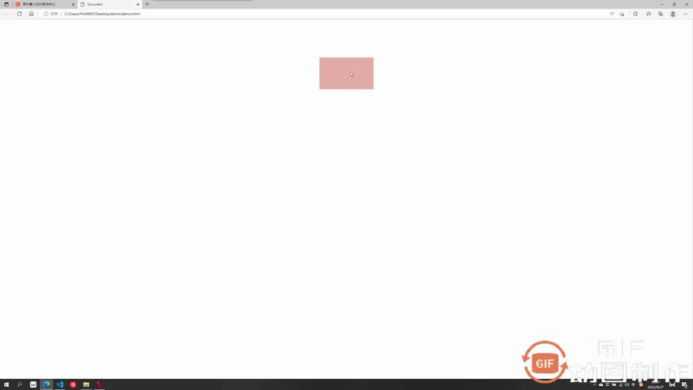
transition-property 用于指定要参与过渡的属性名称,例如你想要长宽过渡,那么在后面写 width,height 即可,如果想省事可以写成 all,即全属性都变化。
<style>
div{
width: 200px;
height: 200px;
background-color: rgb(255, 156, 156);
transition-property: width,height; //设置要过渡的属性为宽高
}
div:hover{
width: 300px;
height: 300px;
}
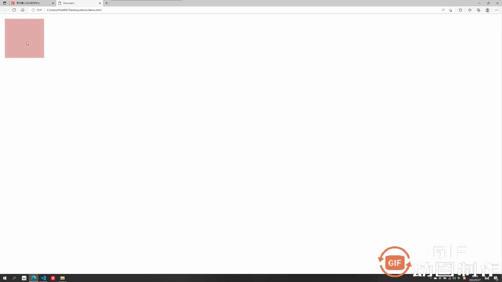
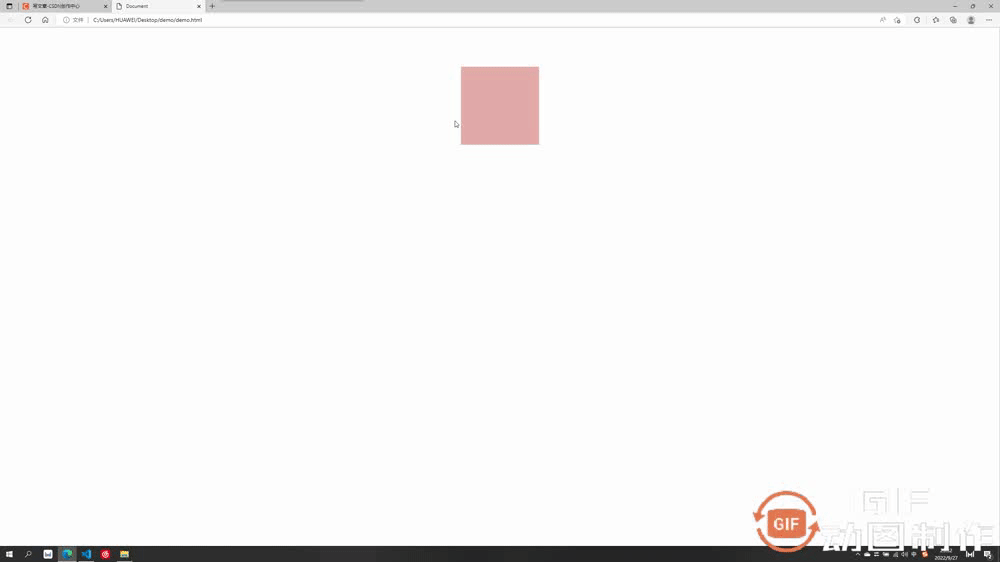
</style>登录后复制过渡效果:长宽过渡前均为 200,过渡后变成了 300

1.2 transition-duration 过渡时间
transition-duration 用于指定过渡的时间,只需要在后面加上想要过渡的时间即可,可以分别设置与 property 相对应的过渡时间,也可以只设置一个应用于全部
    <style>
        div{
            width: 200px;
            height: 200px;
            background-color: rgb(255, 156, 156);
            transition-property: width,height;
            transition-duration: 3s,1s;
        }
        div:hover{
            width: 300px;
            height: 300px;
        }
    </style>登录后复制
过渡效果:长宽过渡前均为 200,在经历了长为3s,宽为1s的过渡后长宽均变成了 300

1.3 transition-delay 过渡延迟
transition-delay 用于指定过渡的延迟等待时间,即多少秒后开始过渡,只需要在后面加上想要等待的时间即可,可以分别设置与 property 相对应的等待时间,也可以只设置一个应用于全部
    <style>
        div{
            width: 200px;
            height: 200px;
            background-color: rgb(255, 156, 156);
            transition-property: width,height;
            transition-duration: 3s;
            transition-delay: 2s;
        }
        div:hover{
            width: 300px;
            height: 300px;
        }
    </style>登录后复制
过渡效果:光标放上去后等待了2s才开始过渡

1.4 transition-timing-function 过渡类型
transition-timing-function 可以用来设置过渡时的类型,其有以下常用类型:
- ease:先加速后减速
- linear:匀速
- ease-in:加速
- ease-out:减速
- ease-in-out:先加速后减速(较ease速度变化效果明显)
- cubic-bezier:贝塞尔曲线
速度变化大同小异只是变化速度不同,此处只举一个 ease-in 的例子
    <style>
        div{
            width: 200px;
            height: 200px;
            background-color: rgb(255, 156, 156);
            transition-property: width,height;
            transition-duration: 3s;
            transition-timing-function: ease-in;
        }
        div:hover{
            width: 300px;
            height: 300px;
        }
    </style>登录后复制
过渡效果:过渡类型为 ease-in 逐渐加速
1.5 过渡的连写形式
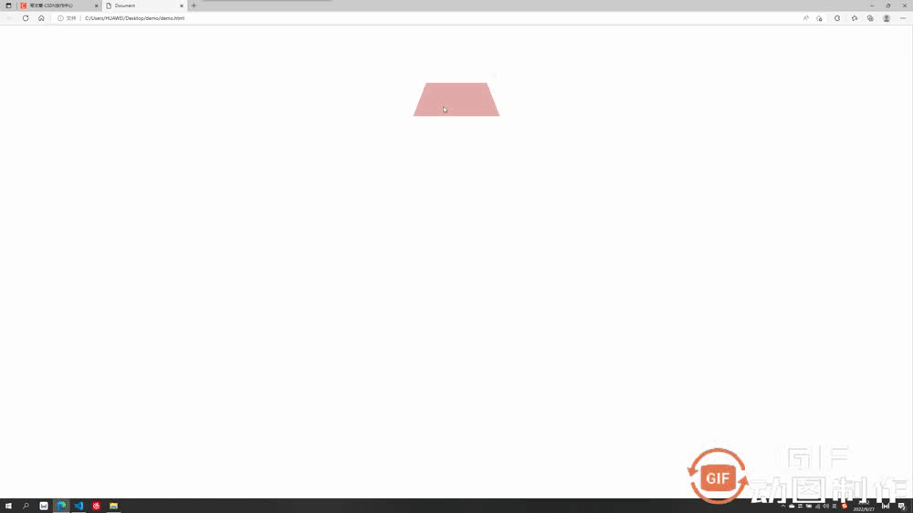
我们过渡中最常用的还是连写形式,连写形式过渡属性我们方便起见写作 all 即可,然后别的过渡属性跟在后面空格隔开即可,哪个元素要做过渡就把过渡加给哪个元素,此处是div鼠标放上后扩大,但是是div做过渡,所以过渡属性加给div
    <style>
        div{
            width: 200px;
            height: 200px;
            background-color: rgb(229, 171, 171);
            transition: all 2s linear;
        }
        div:hover{
            width: 300px;
            height: 300px;
        }
    </style>登录后复制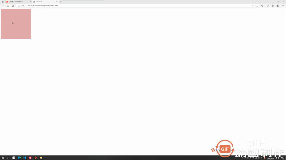
transform 可以让过渡元素产生一些常规的 2D 动画效果,例如旋转,位移,缩放,扭曲......等等,以及 3D 的立体效果。
transform 2D/3D中常用属性:
- transform-origin:基点
- transform:translate:平移效果
- transform-rotate:旋转效果
- transform-scale:缩放效果
下面会对这六个常用属性做出逐个讲解,有个注意点要提醒:大多数情况下,如果既有旋转也有移动,要先写移动再写旋转
2.1 transform-origin 基点
基点就是位移或者旋转等变形围绕的中心,默认都是中心点,例如先举个旋转的例子(旋转后面会讲到)大家体会一下基点的概念。切记:基点设置给要过渡的元素
基点的值:
基点的值可以是具体数值例如 transform-origin:20px 30px; 第一个为x方向,第二个为y方向,也可以是方位名词 transform-origin:top left; 此处先写x或先写y方向都可以,此处 top left 表示基点为左上角,bottom right 表示右下角......
默认基点为元素正中心
<style>
div{
width: 200px;
height: 200px;
background-color: rgb(229, 171, 171);
margin: 100px auto;
transition: all 2s linear;
}
div:hover{
transform: rotateZ(90deg);
}
</style>登录后复制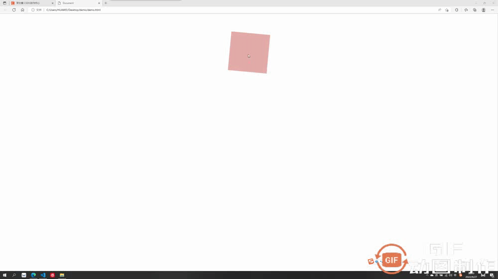
设置基点为 transform-origin:bottom left; (左下角)
    <style>
        div{
            width: 200px;
            height: 200px;
            background-color: rgb(229, 171, 171);
            margin: 100px auto;
            transition: all 2s linear;
            transform-origin: left bottom;
        }
        div:hover{
            transform: rotateZ(90deg);
        }
    </style>登录后复制
2.2 transform:translate 平移
平移可分为以下几种:
- transform:translateX 沿水平方向平移
- transform: translateY 沿竖直方向平移
- transform: translateZ 沿Z方向移动的距离,不加透视的话看不出来效果,这个放在后面3D板块讲解
- transform:translate(x, y, z) 沿和向量方向平移,第一个为x方向移动距离,第二个为y方向移动的距离,第三个为z轴移动的距离,中间要求逗号隔开
案例中我们只举例第最后一个组合写法,其它都是单独的朝某个方向移动较为简单
    <style>
        div{
            width: 200px;
            height: 200px;
            background-color: rgb(229, 171, 171);
            transition: all 2s linear;
        }
        div:hover{
            transform:translate(200px,200px)
        }
    </style>登录后复制
效果为水平走200px,竖直走200px
2.3 transform:rotate 旋转
旋转的角度单位为 deg,要旋转360度即为 360deg
旋转可分为以下几种:
- transform:rotateX 以x为轴旋转,不加3D透视看不出立体3D效果,后面讲到3D再讲解
- transform: translateY 以y为轴旋转,不加3D透视看不出立体3D效果,后面讲到3D再讲解
- transform: translateZ 沿Z为轴旋转,为2D平面旋转,可以设置基点
此处先讲第三个不需要加3D透视的沿z轴旋转
<style>
div{
width: 200px;
height: 200px;
background-color: rgb(229, 171, 171);
margin: 100px auto;
transition: all 2s linear;
}
div:hover{
transform: rotateZ(90deg);
}
</style>登录后复制效果为绕z轴旋转了90度
2.4 transform:scale 放缩
此处放缩的优点在于其是不影响其他页面布局的位置的,并且可以设置基点,默认基点为中心,放缩默认为围绕中心向外扩大或向内缩小,参数直接填写 要放缩的倍数即可,例如要放缩2倍: transform:scale(2)
    <style>
        div{
            width: 200px;
            height: 200px;
            background-color: rgb(229, 171, 171);
            transition: all 2s linear;
            margin: 100px auto;
            transform-origin: top left;
        }
        div:hover{
            transform:scale(2)
        }
    </style>登录后复制
效果为以左上角为基点扩大了两倍
这一板块就要开始我们的3D效果了,上述案例中的沿z位移,绕x/y旋转等等,其实都是3D的动画效果,我们需要加上透视属性才能有用:perspective: 1000px; 数值是视距可以自己设置,这个值大小可以根据自己的视觉感受调整满意即可。
注意:透视要加给需要3D效果的元素的父元素
举个例子感受下透视perspective的重要性:
3.1 不加透视的绕x轴旋转
    <style>
        div{
            width: 200px;
            height: 200px;
            background-color: rgb(229, 171, 171);
            transition: all 2s linear;
            margin: 100px auto;
        }
        div:hover{
            transform:rotateX(360deg)
        }
    </style>登录后复制
不加透视视觉效果毫无立体感
3.2 加透视的绕x轴旋转
透视要加给需要3D效果的元素的父元素,此处div的父元素为body,所以给body加透视
    <style>
        body{
            perspective: 500px;  //透视
        }
        div{
            width: 200px;
            height: 200px;
            background-color: rgb(229, 171, 171);
            transition: all 2s linear;
            margin: 100px auto;
        }
        div:hover{
            transform:rotateX(360deg)
        }
    </style>登录后复制
加上透视后有了近大远小的立体呈现感,不同的透视值对应的效果也不同,自己觉得合适即可,绕 y 旋转同理。
3.3 加透视的沿z轴平移
加上透视后沿z轴移动,我们想想是不是效果应该是慢慢变大或变小
    <style>
        body{
            perspective: 500px;
        }
        div{
            width: 200px;
            height: 200px;
            background-color: rgb(229, 171, 171);
            transition: all 2s linear;
            margin: 100px auto;
        }
        div:hover{
            transform:translateZ(200px)
        }
    </style>登录后复制
沿z平移200px,视觉上立体感为盒子放大了

3.4 重要属性:是否开启3D效果呈现
这个属性为 transform-style,默认值为 flat ,即不开启子盒子3D效果保持呈现,如果值改为 preserve-3d,则开启子盒子3D效果保持呈现,这个属性和透视一样也是 写给父级,但是影响的是子盒子3D效果是否保持呈现
- transform-style:flat 默认值,代表不开启保持子盒子3D效果
- transform-style:preserve-3d 代表开启保持子盒子3D效果
举例子说明一下 :
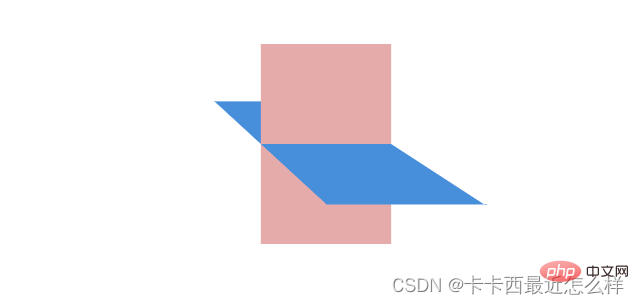
例如我们想做出这个效果,理论上只需要让蓝色的子盒子绕x旋转一定角度,再让外部粉色大盒子绕y旋转一定角度即可呈现
第一步:
让蓝色子盒子绕x旋转一定角度,并且记得父盒子添加透视
        .out{
            width: 200px;
            height: 200px;
            background-color: rgb(229, 171, 171);
            margin: 100px auto;
            perspective: 500px;
        }
        .inner{
            width: 200px;
            height: 200px;
            background-color: rgb(71, 142, 219);
            transform: rotateX(60deg);
        }登录后复制
成功呈现出以下效果:
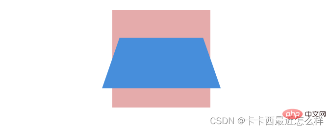
第二步:
让外部粉色父盒子绕y旋转一定角度即可,由于外部大盒子也需要透视效果,所以给其父元素body也要加上透视
    <style>
        body{
            perspective: 500px;
        }
        .out{
            width: 200px;
            height: 200px;
            background-color: rgb(229, 171, 171);
            margin: 100px auto;
            transition: all 2s;
            perspective: 500px;
        }
        .inner{
            width: 200px;
            height: 200px;
            background-color: rgb(71, 142, 219);
            transform: rotateX(60deg);
        }
        .out:hover{
            transform: rotateY(50deg);
        }
    </style>登录后复制
出现了很严重的问题,蓝色子盒子的透视效果没有呈现出来
这时候就需要我们这个很重要的属性了 transform-style:preserve-3d 开启子元素的3D效果保持
第三步:
开启内部蓝色盒子的3D效果保持 transform-style:preserve-3d,注意要写给父级。另外我们的透视可以写给父亲的父亲,所以此处当父子两个盒子都需要透视时,只需要给父亲的父亲body加上透视即可,父亲不需要再加透视。
    <style>
        body{
            perspective: 500px;
        }
        .out{
            width: 200px;
            height: 200px;
            background-color: rgb(229, 171, 171);
            margin: 100px auto;
            transition: all 2s;
            transform-style: preserve-3d;  //开启子元素3D保持
        }
        .inner{
            width: 200px;
            height: 200px;
            background-color: rgb(71, 142, 219);
            transform: rotateX(60deg);
        }
        .out:hover{
            transform: rotateY(50deg);
        }
    </style>登录后复制
更多编程相关知识,请访问:编程视频!!
以上就是带你吃透CSS3属性:transition 与 transform的详细内容,更多请关注zzsucai.com其它相关文章!


 微博登录
微博登录 QQ登录
QQ登录